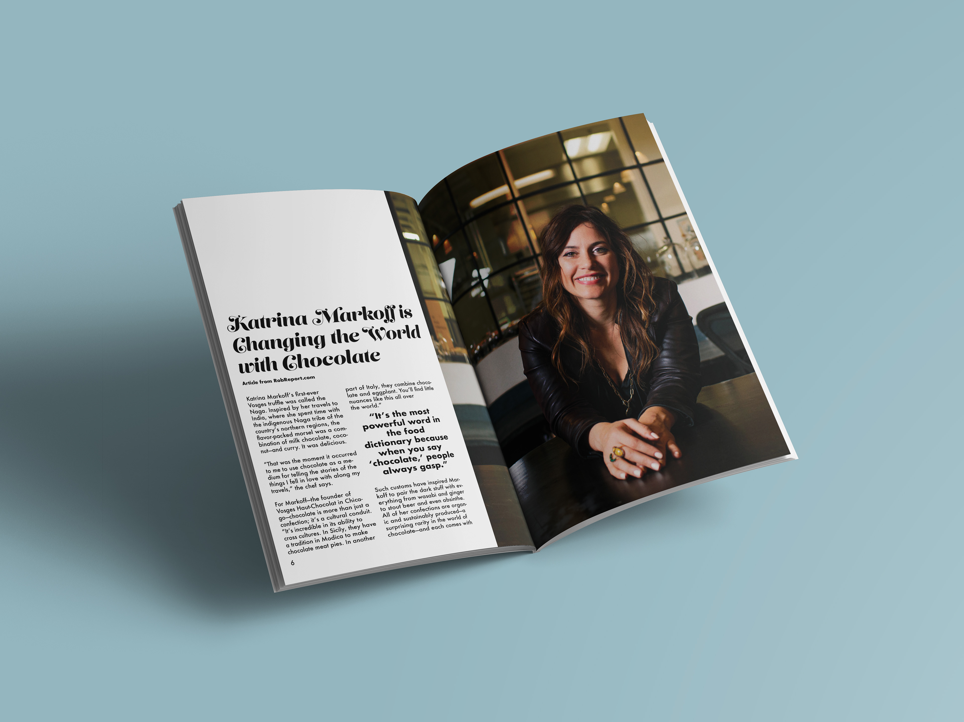
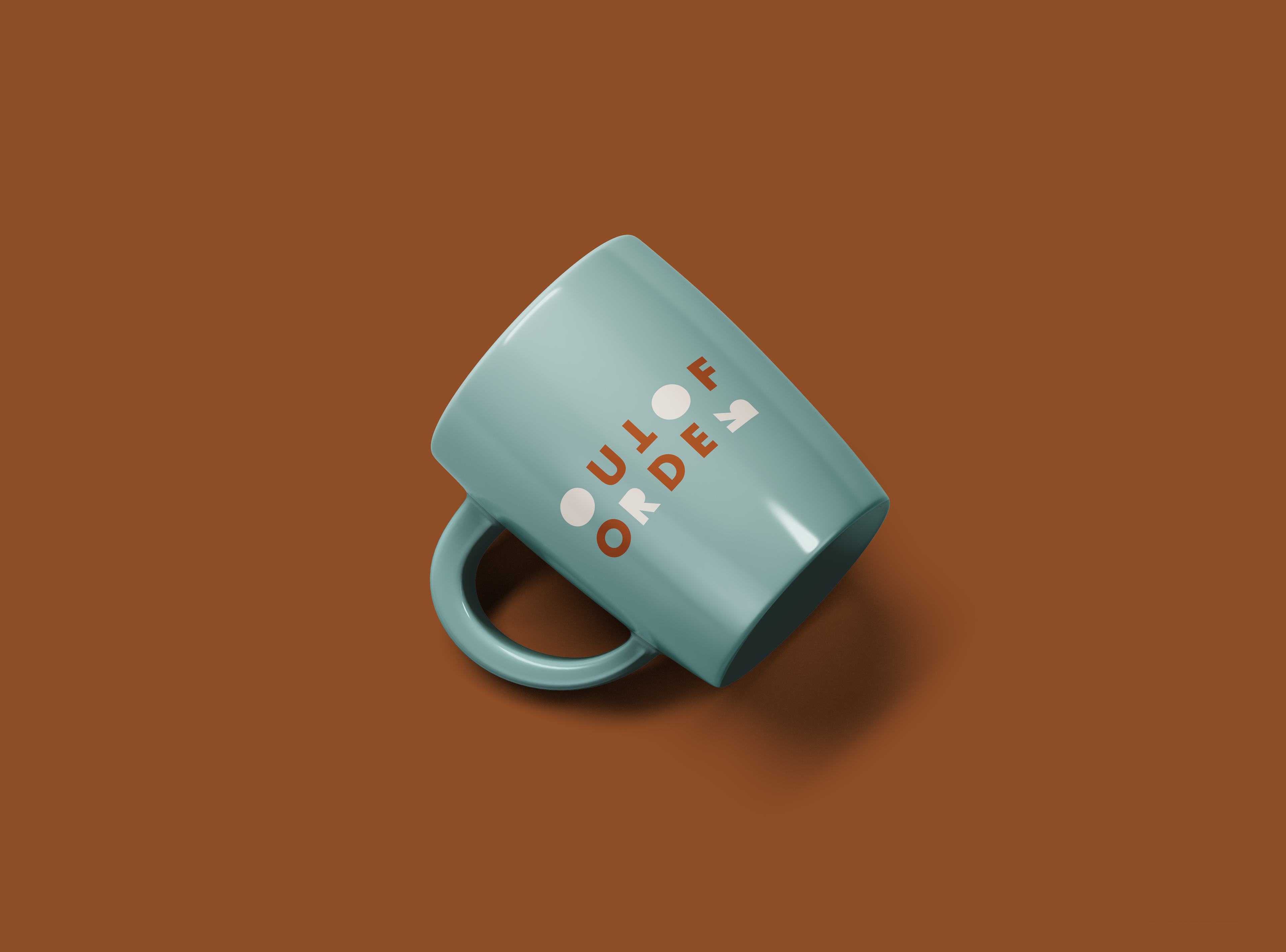
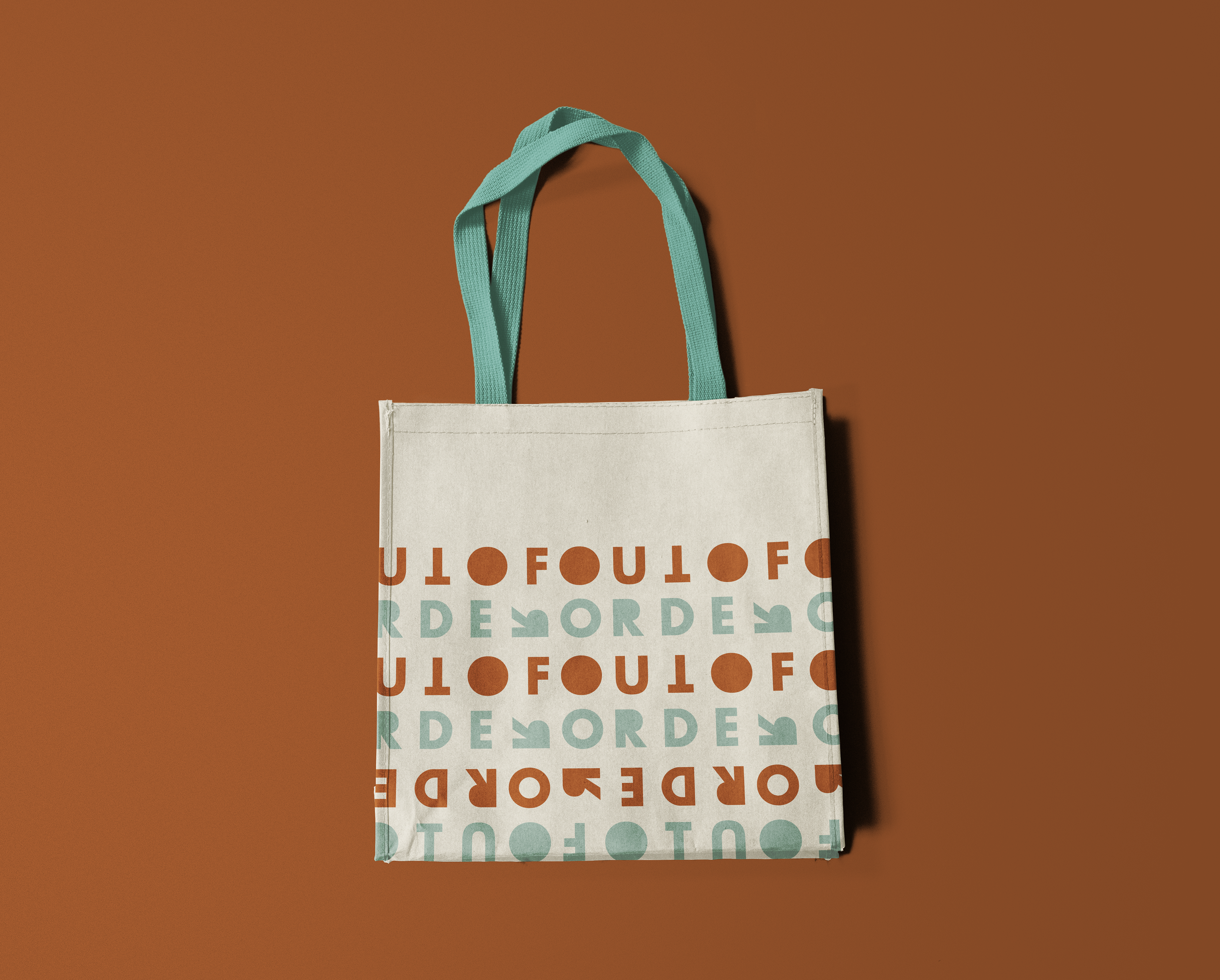
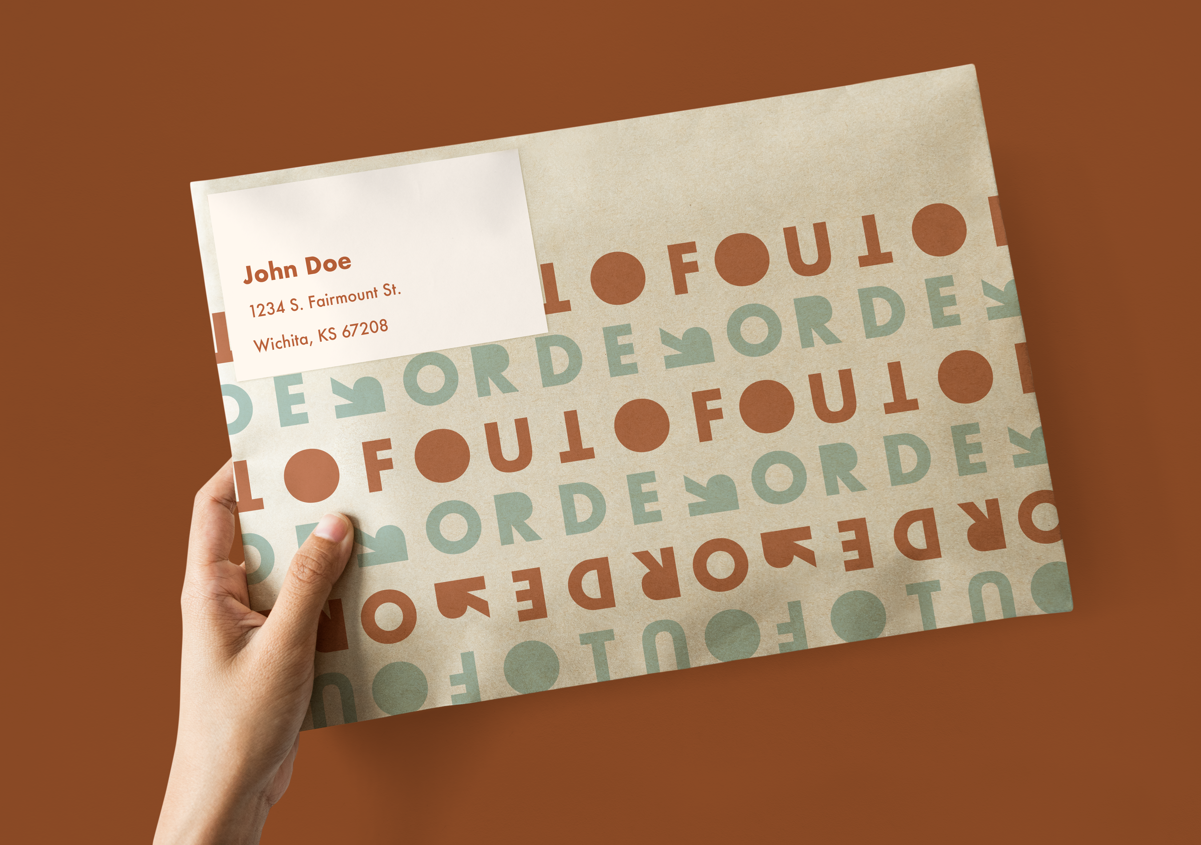
This is a concept of a publication that would showcase different art forms and crafts. The name "Out of Order" refers to the breaking of rules and boundaries that so often happens in art. For the logo, I used a sans serif typeface, rearranging some of the letters to go with the name of the publication, and filling in some of the shapes inside the letters to give me more solid shapes to work with in the branding. The issue featured in this project focuses on chocolate making. As for the colors, I used a burnt orange to compliment the browns in the chocolate, and a dusty, pale teal to contrast the orange.