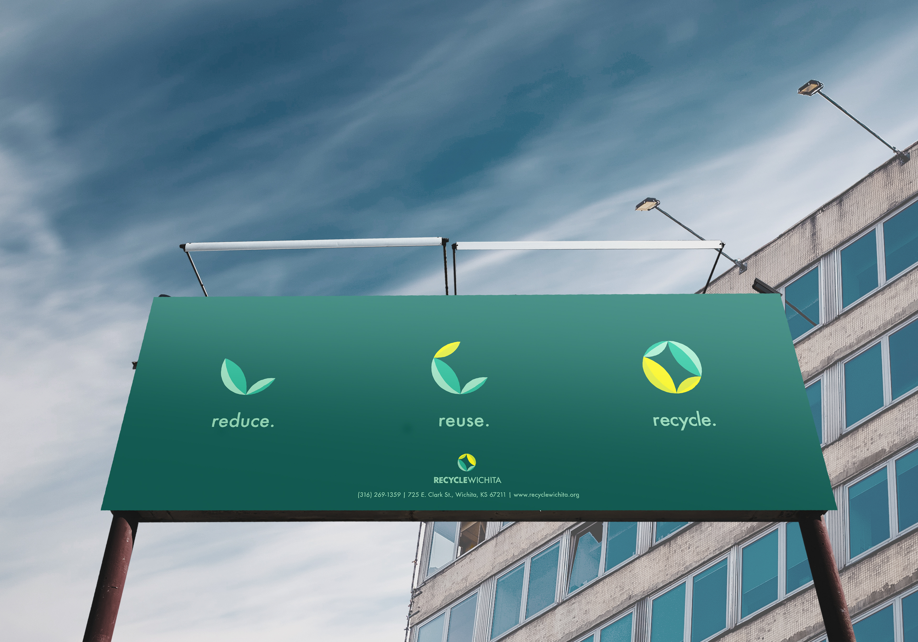
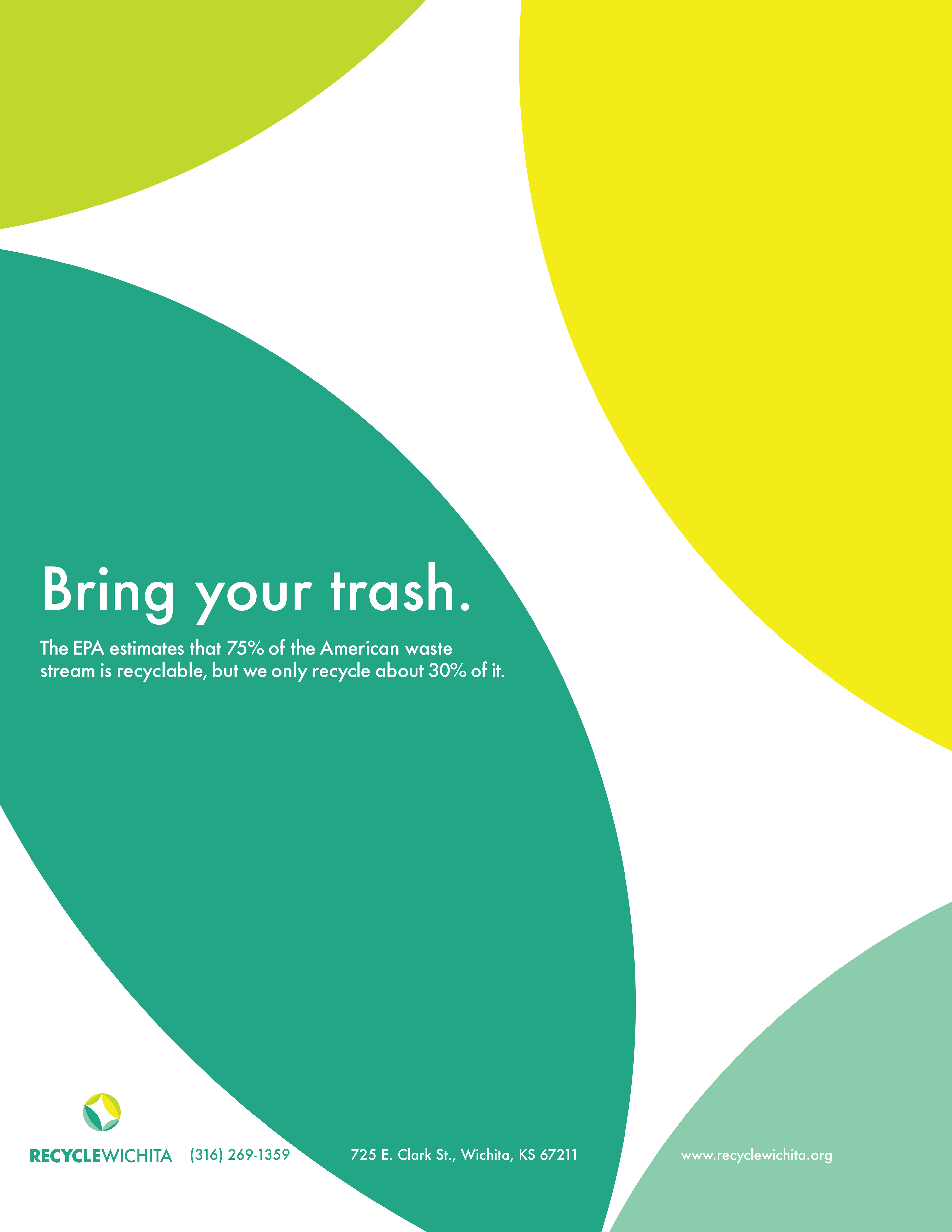
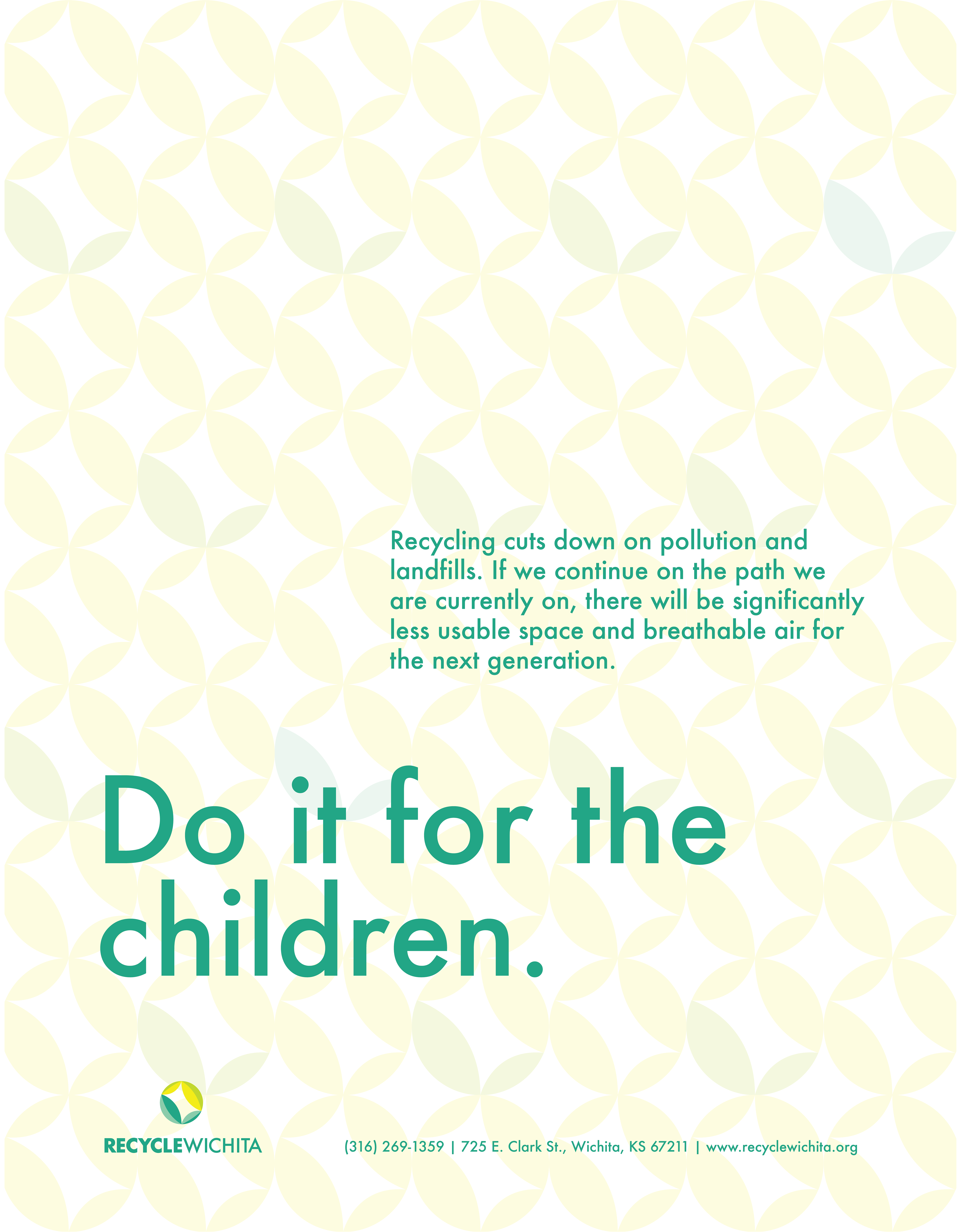
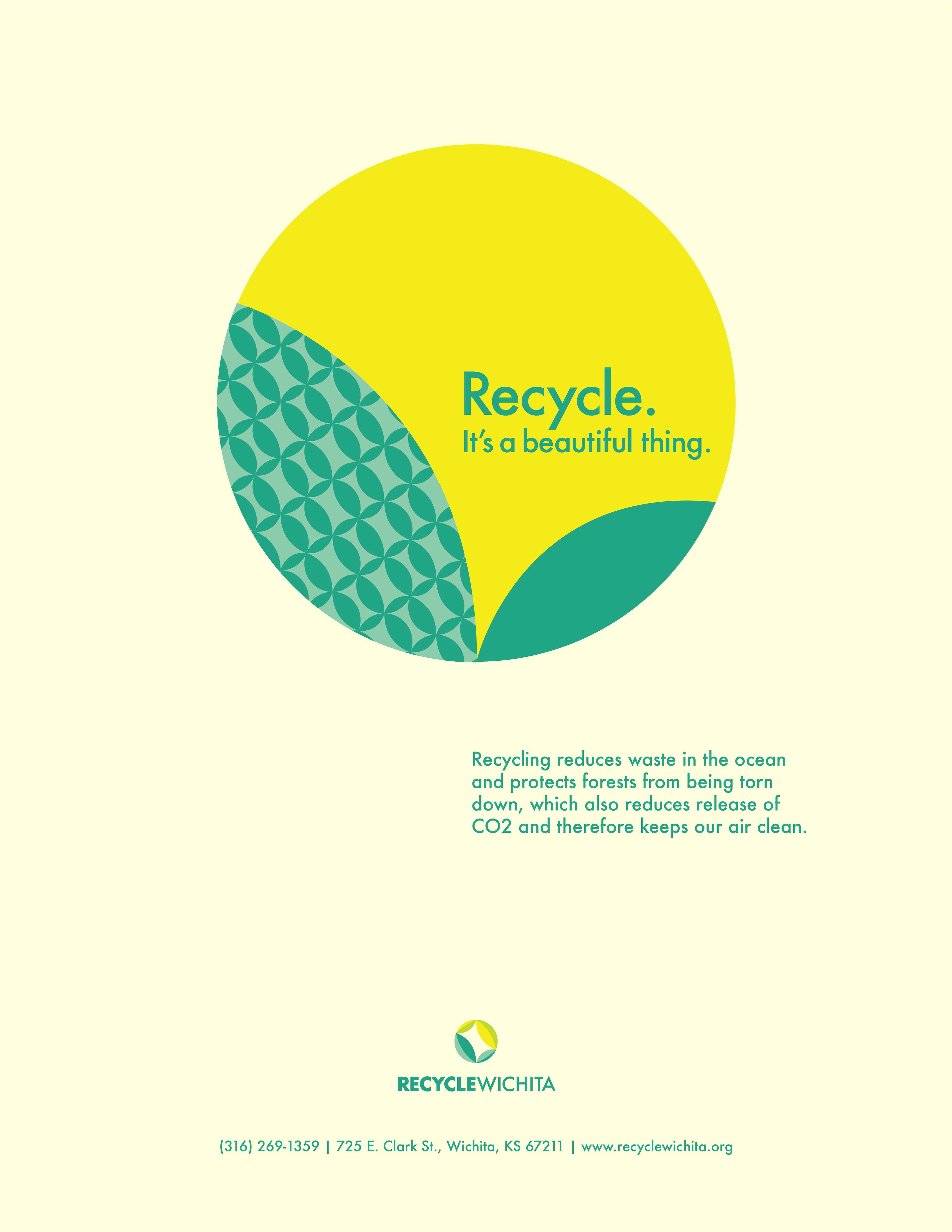

This is a rebranding concept I did for a nonprofit recycling company in Wichita. The leaf symbol repeated forms a circle to represent the recycling process. This symbol can be taken apart to create different icons, shapes, and patterns to be used throughout branding. I took varying shades of green to give a face lift to the typical green always used in recycling imagery, and to make the branding feel more fun and eye-catching. Included in this project are logo applications, a billboard, and some advertisement flyers that might be displayed around town.